Tuesday, February 19, 2013

Quote


“Environmental issues such as sustainability, the protection of resources or reducing emissions have long been the focus of politics, industry and the economy. High time, then, to examine their role in the world of architecture more closely.”

I came across this quote on archdaily.com.  Since we are exploring the combination of serial planes, architecture, and recyclable materials in our 2nd project, I thought it’d be appropriate to share. I like that they are pushing for architects to examine their effect on the environment.  They also talk about how the construction industry is taking new steps to recycle materials.  Surprisingly, entire building components can be repurposed, while still maintaining intelligent design.


Monday, February 18, 2013

Serial Planes

Worked on developing serial planes on foam core today. Love how they came out! 


Saturday, February 16, 2013

Artist: Luciana Rondolini


Luciana Rondolini is an Argentinian artist who explores the ideas of artificiality, beauty, and value within her work. 

Her most recent work incorporates actual fruit, which shall inevitably decay over time.  The exterior of the fruits (apples, bananas, pears, etc.) are encrusted with jewels.  In contrast with this, portions of the insides of the fruits are exposed.  This exhibition of the decaying inner flesh is a deliberate move by the artist.  She wants to make the viewer think about the “manufactured aesthetic” that dominates the culture of today.


 Along with her 3-dimensional work, Rondolini incorporates drawings into her exhibitions as well.  These drawings are an extension of her other works and therefore possess a similar meaning. 

Her work is very intriguing and captivating.  I enjoy the message that she expresses through her art and the way in which she presents it.  If I had the opportunity, I would love to view the decaying fruits in person.

Friday, February 15, 2013

Hearts, hearts, & more hearts

Spent a good portion of valentines day making more origami hearts for the current project. I thought it was fitting. <3

Monday, February 11, 2013

Origami In the Pursuit of Perfection


I came across this video on Youtube, Origami In the Pursuit of Perfection.  On his website, the creator, Mabona Origami, describes how he  "designed the origami models and consulted the stopmotion aswell as the computer animators of this world wide corperate movie that tells the story of the japanese sports brand ASICS." 
I thought the video was really fun & also relevant since I'm in the midst of folding origami hearts for the Modular Relief Project. Definitely worth watching!

Catching Up: Process Pics

Been so busy that I was slacking on posting my in class process shots! Here's a glimpse at what's going on:

Last week's class hard at work

Modular relief project: last weekend's progress

Imani: my paper heart partner ;)

Modular relief project: in class progress

Saturday, February 2, 2013

Prototype

Working on the prototype for our current project. Couldn't find jewelry connectors, so I'm making them by hand. So thankful that the girls down the hall had a bunch of pliers!!

Friday, February 1, 2013

Artist: Yulia Brodskaya


Yulia Brodskaya is an innovative artist, originally from Moscow, now residing in the UK.  Her creative interests include textile painting, origami, collage, as well as traditional fine arts.  She enjoys a variety of experimentation and often explores new possibilities.  Her ingenious paper illustrations have helped Yulia to gain international recognition and an extensive list of clients.  Along with this, her work has been featured in a large selection of magazines and in a variety of books.

When speaking of her work Brodskaya is passionate and honest…
“I believe that one of the main reasons I enjoy the paper craft, is due to my love of the material: paper. Although I've always had a special fascination for paper, it has taken me a while to find my own way of working with it; and then it took a little longer to find out that the technique I have been using so intensively is called quilling - it involves the use of strips of paper that can be rolled, shaped, and glued to the background.”

            I find her work to be highly inspirational as well as motivational. Not only is Yulia’s art captivating and eye catching, but it is also expressive and holds my interest.  Specifically, when looking at her “PAPERgraphic” work I am enamored, intrigued, and wish to know more about the artist and her process.  Although each piece bares her signature style, separately they each evoke a feeling all their own.


Research Homework

1. The design process is most clearly described as a “method of unearthing appropriate solutions to cultural needs.”  Design can be separated in to categories: expressive and utilitarian.  An expressive piece is made with the intention of communicating cultural, personal, and aesthetic experiences.  On the other hand, a utilitarian design is expected to perform distinct physical tasks.  Developing a piece that meets cultural needs is most often a combination of both utilitarian and expressive design. The process of design can be clearly outlined in individual steps.  The first three steps are as follows:
1.     Identify The Problem
2.     Generate Ideas
3.     Evaluation & Criticism
In step 1 it is crucial to recognize & define the problem at hand.  The designer must determine if there is a problem, what it is, and if it requires a solution.  Step 2 allows creativity and expression to come into play.  It may involve brainstorming, mental inventory, research, lateral thinking, sketching, and note taking.  In the 3rd step the ideas produced during step 2 must be assessed with the problem’s criteria and parameters in mind.  Once the most favorable solutions are defined, the drawings, models, or mockups can be refined.

2. Three-dimensional form includes actual plane and volume.  Unlike two-dimensional design that creates only the illusion of space, three-dimensional design must be viable in a tangible environment.  Also, it is highly concerned with material and structure. Therefore, the designer must take into account the physical laws that may restrict his/her work.

"Plateau Lamp" by Ferreol Babin

3. Space is an area of openness that is indispensible when manipulating material into form.  It “activates and defines” form, while at the same time form “activates and defines” space.  If a three-dimensional work lacks form or space it may be seen as a substandard design.  In order to develop good design space must be taken into consideration during the creative process.


4. Positive and negative space in 3-D form is one of four principles that govern how a form occupies space.  As a spatial principle it helps to determine the relation of form to space.
"Ornamental Hands" by Jennifer Crupi,
Sterling silver, acrylic, inkjet print on vellum, 15" x 8.5" x 5.5"
Click here for more info on Jennifer Crupi's work

5. Direction, like positive and negative space, is a spatial principle.  It is relative and measures the angle of an element with in a space and in comparison to other elements in a composition. 
"Ban Pavilion" by Orprojects
(for the 2012 Beijing Design Week, China)
image (c) Jasper James and Orproject
Click here for more info on the pavilion

6. Scale is defined as the size of a form in comparison to the space containing it, another form, or the human body.  Usually the size of the average human being is the primary determinate of scale.  The scale of a design can be classified in three different ways: object, human, and monumental.  Along with this, scale can exist on distinct levels: miniature, environmental, and geographic.

"Planet" by Marc Quinn
(Image courtesy Gardens of the Bay)
Click here for more info on "Planet"

7. Point of view relies on the viewers physical position in space in relation the forms being viewed.  Frontal and full-round points of view are relied on heavily in design and change according to the designer’s intent and the composition of the piece.  Frame of reference is a “perpetual constraint.”  For a three-dimensional object that is site-specific (especially one created to be viewed in an architectural space), walls, floors, and ceiling define a three-dimensional frame in which to read the object.  However, most 3-D objects exist within a frame of reference that is not clearly marked.  Most frame of reference is constructed by two elements: a vertical axis and a ground plane.

Presentation Outline 1


·      To Design: planned arrangement of visual elements to construct an organized visual pattern
o   Content: the concept/subject/narrative
o   Form: manipulation of materials & visual characteristics
·      All design evolves from point/line/plane
·      Design Principles:
o   Unity/Harmony/Simplicity/Emphasis
o   Focal Point/Scale/Proportion
o   Balance/Rhythm

·      Design Elements:
o   Line

o   Shape/Volume/Mass
o   Texture

o   Illusion of Space

o   Time and Kinetics(Motion)
o   Value/Color

o   Virtual Space
·      Design principles and elements work together in a piece to aid in creating a unified visual.
·      Analysis: problem solving & communicating an idea
·      Perception: nature, art history, & culture
·      Material explorations: visual experimentation, process sketching & building
·      Compare & contrast: 2-D vs. 3-D
o   Things with 2 dimensions possess length & breadth (but have no depth)
§  We can organize visual elements to create harmony & unity within a picture plane
o   2-D Design leads to the formation of space, aesthetic, & intellectual content  (included mark-making, drawing, painting, printing, & writing)
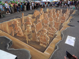
Street art by By Leon Keer, Peter Westerink, Ruben Poncia and Remko van Schaik

o   In 3-D the goal is to organize visual elements (to create harmony & unity) in relation to…
§  Length: vertical direction: up & down
§  Breadth: horizontal direction: left to right
§  Depth: transverse direction: forwards & backwards

o   3-D is defined by x, y, z
§  x = depth
§  y = breadth
§  z = length
o   To obtain a solid understanding of a 3-D object one must view it from all directions and various distances